
Why does WordPress’s modern editor feel like learning a new language? If you’ve struggled to create content since 2018, you’re not alone. The shift to a visual, component-driven system left many users longing for the simplicity of the Classic Editor. But what if the confusion isn’t about the tool itself—it’s about how we approach it?
WordPress 5.0 revolutionized content creation by replacing text-based editing with modular design. Instead of working in a single field, you now build pages like digital LEGO sets. Each piece—text, images, buttons—exists as its own movable element. This flexibility empowers creators but demands a fresh perspective.
Our brains initially resist change, especially after years of using the Classic Editor. The current system requires understanding relationships between components rather than just typing. Once mastered, though, it unlocks precision and creativity older tools couldn’t match.
Key Takeaways
- WordPress introduced its block-based system in 2018 to modernize content creation
- The visual editor uses modular components for flexible page design
- Initial confusion stems from breaking old text-editing habits
- Blocks enable drag-and-drop customization unavailable in classic workflows
- Practice transforms perceived complexity into creative freedom
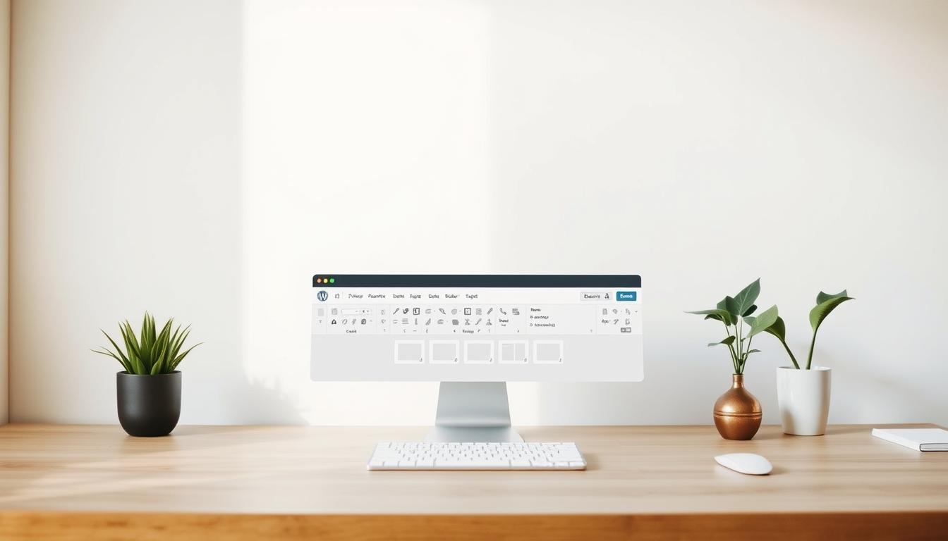
Introduction to Gutenberg Blocks and the Block Editor
Discover how WordPress transformed content creation with modular design. Instead of wrestling with code or clunky menus, you now assemble websites using specialized components. These elements—text, media, buttons—operate like puzzle pieces that snap into place.
Overview of Modular Content Elements
Each modular unit serves a specific purpose. Paragraphs format text, galleries display images, and columns organize layouts. Over 50 default options exist, from simple headings to interactive forms. Drag-and-drop functionality lets you position elements visually, eliminating guesswork.
Customization happens through intuitive controls. Change colors, adjust spacing, or add animations—all without touching HTML. Third-party plugins expand these capabilities, adding niche tools like pricing tables or event calendars.
From Text Fields to Visual Building
Earlier WordPress versions used a single text box resembling Microsoft Word. While familiar, this approach limited design flexibility. The 2018 update introduced object-based editing, where every element became independently adjustable.
This shift mirrors how professional designers work. Instead of writing content linearly, you craft experiences layer by layer. Buttons float beside text, images resize proportionally, and videos embed responsively. The system grows with your skills, offering basic tools for novices and advanced options for experts.
Understanding the Fundamentals of the Gutenberg Editor
Modern website building requires tools that adapt to both structure and creativity. The current WordPress system organizes its components into six functional groups, each serving distinct purposes in content assembly. Let’s explore how these categories work together to simplify complex tasks.

Core Block Types and Their Functions
Text elements form the backbone of most pages. Options like paragraphs, headings, and lists help organize written material clearly. These tools maintain readability while allowing font adjustments and color changes with one click.
Media components handle visual and auditory content. Upload images directly into galleries, embed videos without coding, or share audio clips. Files become downloadable links automatically, making resource sharing effortless.
Structural tools control layout flow. Columns split content side-by-side, while spacers add breathing room between sections. Buttons float independently, letting visitors interact with key actions.
How Components Enhance Content Creation
Third-party integrations expand possibilities dramatically. Add custom code snippets or social media feeds using simple URL pasting. These features eliminate the need for manual embedding or complex plugins.
Brand consistency becomes achievable through theme-aligned elements. Insert logos sitewide, design navigation menus visually, or style comment sections to match your color scheme. Every adjustment reflects immediately across all pages.
External content integrates seamlessly. Display YouTube videos at optimal sizes or showcase Instagram posts without compromising mobile responsiveness. The system handles technical details, letting creators focus on message delivery.
How-To: Mastering Gutenberg Blocks for Effective Content Creation
Building engaging web pages requires mastering the editor’s core mechanics. Let’s break down essential techniques for working with modular components.
Adding and Customizing Blocks
Start by clicking the plus icon in the top-left corner. Hover between existing elements to reveal additional insertion points. Every new component appears ready for adjustments.
Click any element to activate its toolbar. Change text alignment, switch formats (paragraph to heading), or access advanced settings like color schemes. Third-party plugins often add specialized options here.
Rearranging and Grouping Blocks for Better Layouts
Use the List View to see your page’s structure. Drag elements vertically or use directional arrows for quick repositioning. Group related items using these methods:
| Method | Steps | Best For |
|---|---|---|
| Drag-and-Drop | Click six-dot handle → Move | Small adjustments |
| List View | Open panel → Reorder | Complex pages |
| Keyboard Shortcuts | Ctrl+Shift+Z / Cmd+Shift+Z | Quick undos |
Select multiple elements by holding Shift. Move entire sections while maintaining spacing. Columns help organize side-by-side content without coding. Practice these strategies to transform chaotic pages into polished layouts.
Why Gutenberg Blocks Can Be Confusing for New Users
Many creators face a mental roadblock when switching to component-based design. Years of text-focused workflows condition people to view content as flowing paragraphs, not movable pieces. This shift requires rethinking how elements interact—a process that initially slows down familiar tasks.
Common Misconceptions and Initial Challenges
New users often mistake modular tools for being limiting rather than liberating. The abundance of options—over 50 core components—can trigger decision fatigue. Some assume block themes demand coding skills, though they actually reduce technical demands through visual controls.
Three key friction points emerge early:
- Interface overload: Multiple toolbars and settings panels compete for attention
- Layout uncertainty: Arranging components feels less intuitive than typing linearly
- Feature discovery: Hidden capabilities like reusable blocks go unnoticed
The WordPress community faces an education gap. Many developers still promote classic themes, unaware that block-based designs now handle complex layouts. Interactive workshops and step-by-step tutorials could bridge this knowledge divide effectively.
Time invested in learning pays dividends. Users who master component relationships gain precision that old text editors couldn’t match. What initially feels like complexity becomes creative freedom—once the system’s logic clicks into place.
Demystifying “Gutenberg blocks confusing” – Breaking Down the Complexity
Many website creators feel overwhelmed by unfamiliar terms scattered across the editing interface. Let’s translate technical jargon into practical knowledge using real-world comparisons.

Clarifying Terminology and Features
Think of block types as specialized tools in a workshop. Paragraphs handle text, galleries manage images, and buttons drive actions. Patterns work like pre-built furniture kits—combine multiple blocks into ready-made layouts for headers or testimonials.
Reusable blocks act as templates. Save a styled contact form once, then deploy it anywhere on your site. Block themes differ from classic designs by using the Site Editor for global changes. Update your header’s color scheme once, and it applies everywhere automatically.
The floating toolbar and settings panel work together like a Swiss Army knife. Hover over any element to access quick formatting options. Click the gear icon for advanced controls like spacing adjustments or animation effects.
“Consistency across themes is the hidden superpower. Learn one block-based design, and you’ve mastered them all.”
WordPress now offers interactive tutorials showing how these pieces connect. Live workshops help users visualize relationships between components, turning abstract concepts into actionable skills. Master the terminology, and the editor becomes a precision instrument rather than a puzzle.
Enhancing Your Workflow in the Gutenberg Editor
Streamline content creation using hidden productivity boosters built into the platform. These efficiency tools transform tedious tasks into quick actions, letting you focus on creative execution rather than mechanical processes.

Speed Editing With Hotkeys
Master these essential keyboard combinations to slash editing time:
| Action | Windows | Mac |
|---|---|---|
| Save draft | Ctrl + S | Cmd + S |
| Duplicate element | Ctrl + Shift + D | Cmd + Shift + D |
| Insert before | Ctrl + Alt + T | Cmd + Option + T |
Type “/” followed by a block name to insert components instantly. Create reusable templates for common elements like email signup forms or product showcases—update once, and changes apply everywhere.
Expand Capabilities Through Add-Ons
Third-party extensions unlock advanced features missing in core tools. Popular options include:
- Form builders with drag-and-drop fields
- Social media grids displaying live feeds
- Interactive galleries with lightbox effects
Professional developers often use these to create custom layouts without coding. Organize your plugin library regularly to maintain performance while accessing specialized functions.
“The right shortcut can save 15 clicks—those seconds add up fast when publishing daily.”
Leveraging Block Editor Features for Superior Website Design
Unlock professional-grade designs with intuitive column structures and styling groups. Modern website building demands tools that balance precision with creative freedom—exactly what advanced layout features deliver.
Creating Custom Layouts with Columns and Group Blocks
The Columns component offers 12 preset designs ranging from equal splits to focused content areas. Adjust widths by dragging divider lines or entering exact percentages. Nest columns within columns to build magazine-style grids perfect for portfolios or product showcases.
Group multiple elements under unified styling rules. Select related components and apply background colors, spacing adjustments, or animation effects simultaneously. This technique maintains visual consistency across your site while speeding up revisions.
Use the List View to reorganize complex layouts effortlessly. Drag entire sections vertically or collapse groups to focus on specific areas. Pair these features with theme-aligned color palettes for designs that look custom-crafted without coding expertise.