What if creating a stunning online presence required no technical expertise? This tool challenges the myth that professional web design demands coding skills or hefty budgets. With its intuitive drag-and-drop interface, anyone can craft polished sites that adapt seamlessly to any device.
The platform stands out in a crowded market by prioritizing simplicity without sacrificing power. Users gain access to pre-built templates, real-time editing, and advanced customization options. Whether building a portfolio or an e-commerce hub, the system streamlines the entire process.
Two versions cater to different needs: a free tier for basic projects and a pro package for complex requirements. Both include responsive design tools that automatically adjust layouts for mobile viewers. Third-party integrations and performance optimization ensure sites load quickly and function smoothly.
Key Takeaways
- Intuitive drag-and-drop interface eliminates coding requirements
- Extensive template library accelerates development time
- Pro version unlocks advanced customization and theming tools
- Mobile-responsive designs adapt to all screen sizes
- Lightweight architecture maintains site speed
- Flexible pricing accommodates various user needs
Introduction to Beaver Builder for WordPress
Gone are the days when crafting a website meant hours of coding. Modern tools now let users shape their digital spaces visually, with precision and speed. This shift reflects years of innovation in web creation platforms.
The Evolution of Page Builders
Early website tools felt like solving puzzles with missing pieces. Limited layouts, confusing menus, and slow loading times frustrated creators. Over time, demand grew for systems that prioritized user experience over technical complexity.
Today’s solutions offer real-time editing, modular components, and mobile-ready designs. These advancements allow anyone to build professional sites without touching a line of code. The table below shows key differences between older and modern systems:
| Features | Early Builders | Modern Solutions |
|---|---|---|
| Interface | Text-heavy | Visual drag-and-drop |
| Code Quality | Bloated | Optimized |
| Customization | Limited | Advanced modules |
| Performance | Slow | Lightweight |
| User Accessibility | Tech-savvy only | All skill levels |
Why Review Beaver Builder?
Among today’s options, this plugin stands out for balancing power and simplicity. Its clean code structure keeps sites fast while offering deep design control. Users get pre-built templates that adapt flawlessly to phones, tablets, and desktops.
The tool also supports third-party addons and regular updates. This ensures long-term compatibility with evolving web standards. For teams and solo creators alike, it removes barriers between ideas and live websites.
Intuitive Drag-and-Drop Editing Experience
Modern web creation tools have transformed how people shape digital spaces. The editing environment combines visual clarity with practical functionality, letting creators focus on results rather than technical hurdles. Real-time previews and logical tool organization make complex tasks feel approachable.

Visual Interface Breakdown
New users encounter a workspace designed for immediate productivity. The left panel houses content modules and templates, while the main canvas displays live changes. Color-coded boundaries show where elements can be placed, eliminating guesswork.
Three core features streamline the process:
| Feature | Beginner Benefit | Advanced Use |
|---|---|---|
| Column Automation | No grid calculations | Nested layouts |
| Template Library | One-click designs | Custom saves |
| Context Menus | Basic adjustments | CSS controls |
Ease of Learning for Beginners
First-time creators can build complete pages within 15 minutes. Interactive tutorials appear during initial use, teaching core actions through guided practice. The system highlights available modules when hovering over empty sections.
Common tasks follow consistent patterns:
- Drag media widgets directly into text areas
- Duplicate elements with right-click options
- Adjust spacing using visual sliders
Advanced settings remain tucked away until needed, maintaining a clean workspace. This balance allows growth without overwhelming new users.
Customizable Workspace and Interface
Digital creators demand tools that bend to their workflow rather than forcing rigid processes. The editing environment adapts to individual preferences through smart organization and adjustable components. This adaptability shines in two core areas: layout construction and control accessibility.
Tailored Layout Options
Building page structures becomes intuitive through responsive drag mechanics. When moving content blocks near existing elements, the system automatically generates new columns. This eliminates manual grid calculations while maintaining precise alignment.
| Manual Setup | Automated Features |
|---|---|
| Column width inputs | Visual drag adjustments |
| Separate row creation | Smart spacing allocation |
| Device-specific coding | Cross-screen adaptability |
Advanced users appreciate how nested columns and custom breakpoints remain accessible through right-click menus. These layout options stay hidden until needed, keeping the workspace clutter-free.
Flexible Settings Panel
Control panels behave like movable sticky notes rather than fixed toolbars. Users dock frequently used settings menus on either screen edge or keep them floating. This flexibility proves crucial when working on dual monitors or smaller laptops.
| Panel Mode | Best For | Customization |
|---|---|---|
| Fixed Sidebar | Frequent adjustments | Width scaling |
| Popup Windows | Focused editing | Opacity control |
| Dark Theme | Eye comfort | Color contrast |
Switching between full-screen previews and detailed editing takes one click. The interface remembers each user’s preferred configuration across devices, streamlining repeated tasks.
Highly Responsive Design Capabilities
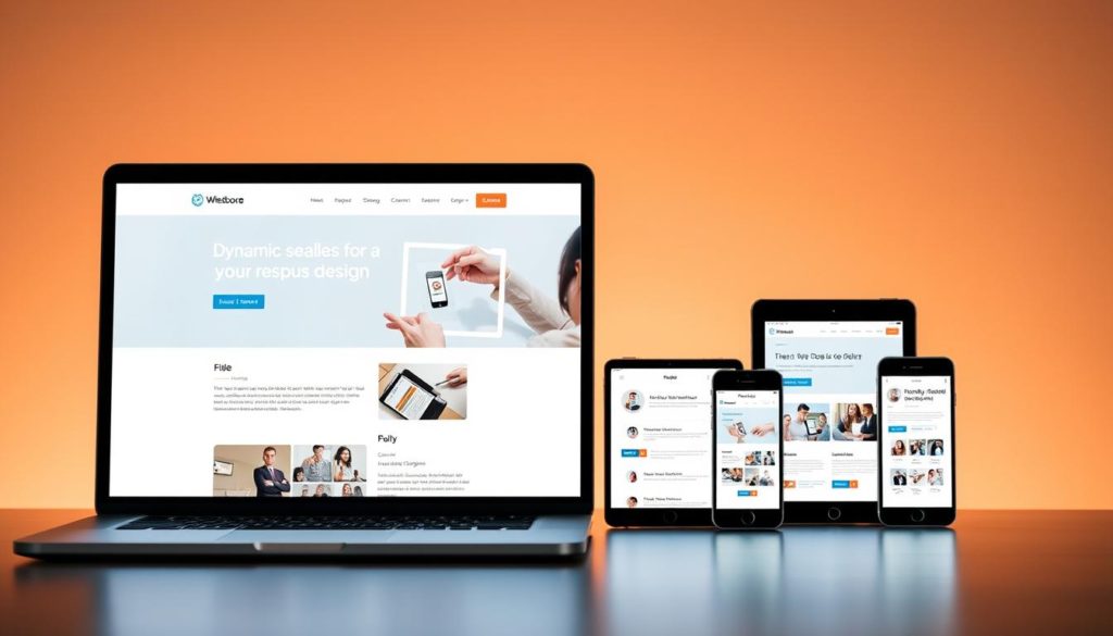
Modern websites live or die by their adaptability. A staggering 54% of global web traffic comes from mobile devices, making fluid layouts non-negotiable. The platform’s design tools ensure content reshapes itself flawlessly across screens while maintaining SEO-friendly performance.

Multi-Device Preview Modes
Real-time visual feedback eliminates guesswork. Designers toggle between desktop, tablet, and phone views with one click. This instant switching reveals how elements reflow, collapse, or expand across devices.
| View Mode | Key Adjustments | Common Uses |
|---|---|---|
| Desktop | Full-width elements | Hero sections |
| Tablet | Stacked columns | Pricing tables |
| Mobile | Hidden modules | Navigation menus |
Custom Breakpoints & Adjustments
Standard responsive systems use fixed screen thresholds. Advanced creators can define exact pixel values where layouts change. This precision ensures brand consistency across uncommon device sizes.
| Feature | Standard Tools | Custom Solution |
|---|---|---|
| Breakpoints | 3 preset sizes | Unlimited user-defined |
| Typography | Global scaling | Per-device controls |
| Element Visibility | Basic hiding | Conditional logic |
Font sizes and spacing adjust independently for each device type. Modules disappear on specific screens without affecting desktop layouts. These granular controls maintain content hierarchy while optimizing space.
Conditional Element Display for Targeted Content
Personalized experiences drive modern engagement. The conditional display tool lets creators tailor page elements to visitor characteristics. No complex coding or extra plugins needed – just strategic content delivery.

User-Specific Content Customization
Membership sites thrive with this feature. Show exclusive offers to logged-in users while hiding registration prompts for existing members. A simple dropdown menu controls visibility rules:
| User Group | Visible Elements | Hidden Elements |
|---|---|---|
| Guests | Signup forms | Premium content |
| Members | Download buttons | Promotional banners |
| Admins | Edit shortcuts | Basic CTAs |
Create multiple versions of content blocks on one page. The system automatically displays the right version based on user status. This reduces page duplication and maintenance time.
Geo-Targeting and Membership Features
Location-based personalization opens new marketing opportunities. Display region-specific pricing or event announcements without creating separate pages. The tool supports 200+ geographic targeting zones.
| Region | Content Type | Conversion Boost |
|---|---|---|
| North America | Dollar pricing | 22% |
| Europe | Multilingual CTAs | 18% |
| Asia | Local payment icons | 31% |
Combine membership levels with geographic rules for advanced scenarios. Show VIP deals to premium users in specific cities. The visual interface makes these combinations easy to configure.
Template Library and Theme Builder Functionality
Visual consistency forms the backbone of professional web design. The platform’s template system bridges creativity and efficiency through reusable components that maintain brand identity across pages. This approach reduces repetitive tasks while ensuring cohesive aesthetics.
Reuse and Save Templates
Pre-designed page sections accelerate project timelines. Users access landing page blueprints containing hero sections, testimonial grids, and pricing displays. These elements adapt through simple color adjustments and font changes.
Customized layouts become reusable assets with one click. Saved templates appear in a personal library for cross-project access. Teams maintain version control by updating master copies that propagate changes site-wide.
Integrating Beaver Themer for Enhanced Layouts
The pro version’s theme builder unlocks structural control beyond standard pages. Designers craft global headers with dynamic menus that adjust to scroll position. Footer templates incorporate conditional elements like seasonal promotions.
Third-party plugin integration expands functionality. Connect Advanced Custom Fields to display user-specific content in archive layouts. While header templates require compatible themes, most modern frameworks support seamless integration.
